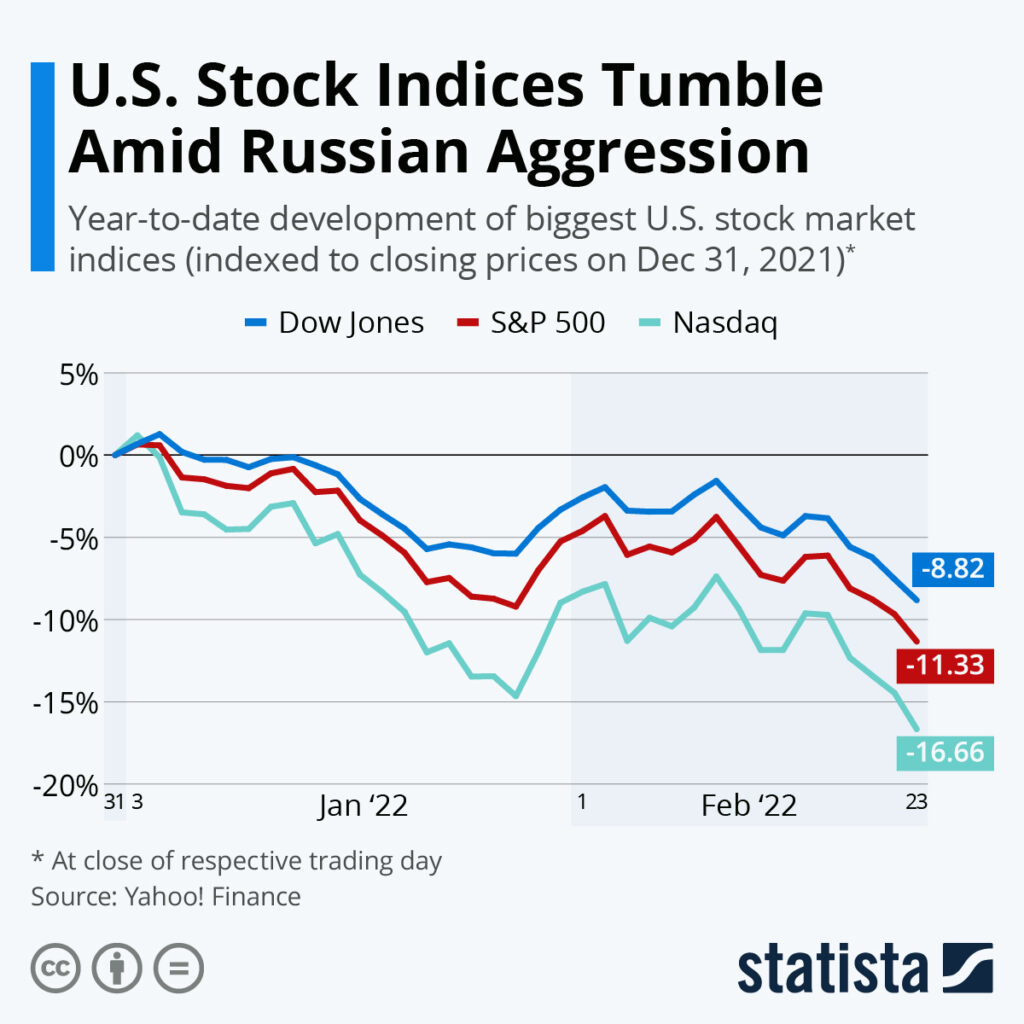
Indexed Charts Kya Hain?
Indexed charts aik aisi graphical representation hoti hain jo specific time period ke data ko compare karti hain. Yeh charts kisi bhi aik reference point ya base value ko 100 maan kar start hote hain aur phir is base value ke mutabiq baqi data points ko represent karte hain. Is tarah se yeh asaan banate hain mukhtalif variables ko aik hi graph pe compare karna.

Indexed Charts Ki Importance.
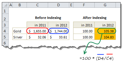
Indexed Charts Kaise Banate Hain?

Index Value=(Current Data PointBase Data Point)×100Index Value=(Base Data PointCurrent Data Point)×100
Indexed Charts Ka Example.
Agar hum aik company ke annual sales ko compare karna chahen, to hum indexed chart use kar sakte hain.
Misal ke tor pe, agar 2010 mein sales 500 units thi aur hum isko base year maan rahe hain.
To indexed values kuch is tarah hongi.
Is indexed chart ko dekh kar hum easily samajh sakte hain ke 2013 mein sales 2010 ke muqable mein 40% zyada hain.

Indexed Charts Ki Advantages.
Indexed Charts Ki Disadvantages.
Indexed charts aik aisi graphical representation hoti hain jo specific time period ke data ko compare karti hain. Yeh charts kisi bhi aik reference point ya base value ko 100 maan kar start hote hain aur phir is base value ke mutabiq baqi data points ko represent karte hain. Is tarah se yeh asaan banate hain mukhtalif variables ko aik hi graph pe compare karna.
Indexed Charts Ki Importance.
- Comparative Analysis: Indexed charts mukhtalif data sets ko compare karne mein madadgar hote hain. Yeh asaan banate hain ke hum dekh saken ke kaunsa variable zyada ya kam growth show kar raha hai.
- Trend Analysis: Yeh charts trends ko identify karne mein madad dete hain. Hum dekh sakte hain ke kisi particular variable ne waqt ke sath kaisa behavior show kiya hai.
- Base Value ke Hisab se Representation: Har data point ko aik base value ke sath compare karne se fluctuations aur changes clear ho jate hain. Yeh understanding mein madadgar hota hai.
Indexed Charts Kaise Banate Hain?
- Base Value ka Selection: Sab se pehle aik base value select ki jati hai, jo usually time period ka pehla data point hota hai. Is base value ko 100 set kiya jata hai.
- Index Calculation: Har data point ko is formula ke zariye calculate kiya jata hai.
Index Value=(Current Data PointBase Data Point)×100Index Value=(Base Data PointCurrent Data Point)×100
- Graph Plotting: Har calculated index value ko graph pe plot kiya jata hai, jo aik line chart ki form mein hota hai.
Indexed Charts Ka Example.
Agar hum aik company ke annual sales ko compare karna chahen, to hum indexed chart use kar sakte hain.
Misal ke tor pe, agar 2010 mein sales 500 units thi aur hum isko base year maan rahe hain.
- 2011: 550 units
- 2012: 600 units
- 2013: 700 units
To indexed values kuch is tarah hongi.
- 2010: (500500)×100=100(500500)×100=100
- 2011: (550500)×100=110(500550)×100=110
- 2012: (600500)×100=120(500600)×100=120
- 2013: (700500)×100=140(500700)×100=140
Is indexed chart ko dekh kar hum easily samajh sakte hain ke 2013 mein sales 2010 ke muqable mein 40% zyada hain.
Indexed Charts Ki Advantages.
- Asaani se Comparison: Mukhtalif variables ko asaan aur visual tariqe se compare kiya ja sakta hai.
- Clarity in Trends: Yeh trends ko highlight karte hain aur kisi bhi unusual activity ko foran detect karne mein madadgar hote hain.
- Data Normalization: Alag alag scales pe data ko normalize karna asaan ho jata hai. Har variable ko base 100 ke sath relate karke represent kiya jata hai.
Indexed Charts Ki Disadvantages.
- Base Value ka Effect: Base value ka selection overall analysis ko affect kar sakta hai. Agar base value accurate na ho to comparison misleading ho sakta hai.
- Complexity in Interpretation: Kuch logon ke liye indexed values aur unka interpretation complex ho sakta hai, especially agar wo familiar na hon indexed charts ke concept se.
تبصرہ
Расширенный режим Обычный режим